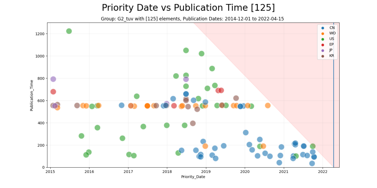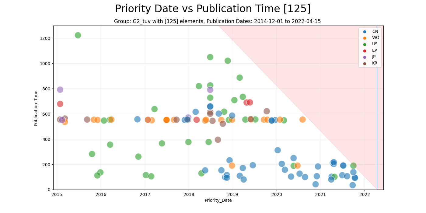
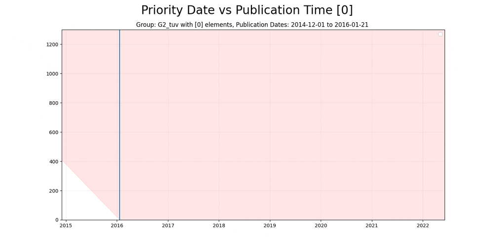
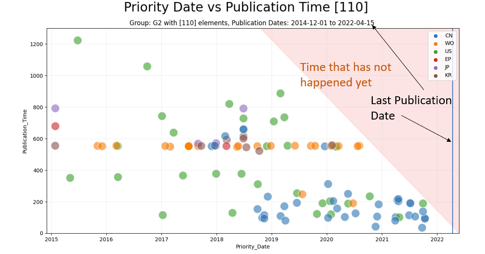
Patent-time Animation
This is one of my favorite plots – the Patent-time plot. It’s a fairly easy way to visualize the interest and development of the technology over time. I took this plot and applied it to the G2 subset from a run done in late may – the dataset is available here for a quality check!
It is worth mentioning that the dataset contains quite interesting patents worth digging into!
How it works
We’re plotting patents as blobs on a grid. One axis for priority date – the date it was submitted and the other for how long time it took to get published. This means that the red colored area represent “time” that has not happened yet as it effectively “days since date on x axis”.
By grouping the patents into regions – USA, China, World and so forth we can see which region is developing at which pace.
For the very interested – the last frame looks like this: