Reading Habits – Part 1
Motivation and Problem definition
I really like to read. One year ago my friend Alex forced me to buy a kindle which really kick-started my reading again. The practicality kept me reading a few pages wherever I went. Simultaneously I moved from a podcast heavy diet my ever-growing reading list using audio-books.
It’s been almost a year later – time to find some stats about my reading habits.
My initial title was “Reading Habits and Modern Data Acquisition” because I really wanted to fill out a the table of meta information such as genre, pages, age by trying new and exciting techniques.
Part 1 – Visualizing the Habits
In this “Part 1” I ended up trying to visualize my habits using pandas and matplotlib with different plots and wrangling the data with both bruteforce and elegance. Turns out these smaller projects are super fun to “do it right” as you care more about the presentation and form than anything else!
Plot Goals
My list is a CSV file which is loaded into pandas. The columns are “Title”, “Author”, “Pages” and “Genre”. The last column is actually super hard to pinpoint as most books can fit in multiple Genre. They can also be specific or general as for example; “Nonfiction” vs “Business & Economics” for the book Narconomics. One-size fits none. We’ll accept that this is very subjective for now.

I care to learn more about my consumption of books;
- How many books have I consumed the last 12 months
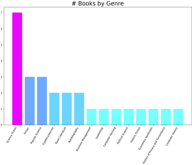
- How many books and pages per genre
- Consumption as book/audiobook per genre
There is no doubt that I love reading sci-fi and try to expand my world and learn while selecting audiobooks. This makes time in car or on the bike much better – but ending a day with some great sci-fi is the best!
Barplot
Having the data available as a dataframe it was pretty easy to get an overview of books and genres.
# 1 - Pages
numberOfPages = df['Pages'].sum()
print("You've consumed", int(numberOfPages), "Pages the last 12 months,")

# 2 - By Type
pagesRead = df[df['Type']=='Book']['Pages'].sum()
pagesListened = df[df['Type'] == 'Audio']['Pages'].sum()
print("of which you have read %d pages and listended to %d pages over %d books" % (pagesRead, pagesListened, len(df)))
You’ve consumed 9947 Pages the last 12 months, of which you have read 3862 pages and listended to 6085 pages over 27 books

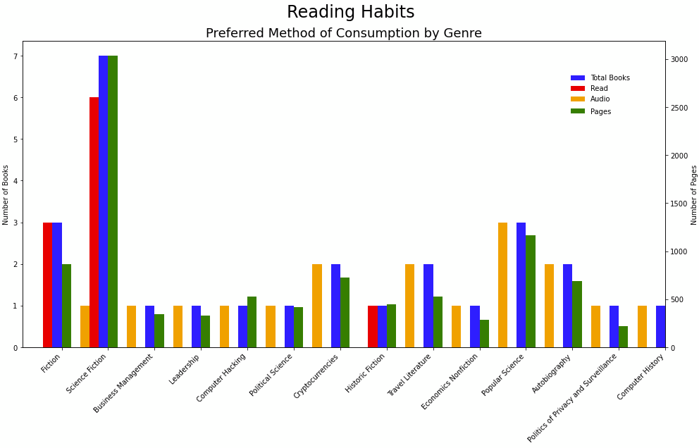
Next I wanted two axes to summarize everything – one for books and one for pages I had to wrangle a whole lot with barplot. This was probably the first time I wanted a more complex plot than the basic ones – and given by the documentation and examples it was a “rare” request!
First challenge was to create a data-structure that made sense for plotting. By genre I wanted to know (total books, pages, #books #audiobooks). It pains me a bit to show you the following code; but this is what bruteforce looks like
genreStats = {x: [0,0,0,0] for x in df['Genre'].unique()}
for i, row in df.iterrows():
    genreStats[row['Genre']][0] += 1              # Books
    genreStats[row['Genre']][1] += row.Pages      # Pages
    if row.Type == 'Book':
        genreStats[row['Genre']][2] += 1          # Read
    else:
        genreStats[row['Genre']][3] += 1          # Listened

# Unpack
keys = [key for key in genreStats.keys()]
books = [value[0] for value in genreStats.values()]
pages = [value[1] for value in genreStats.values()]
read = [value[2] for value in genreStats.values()]
listen = [value[3] for value in genreStats.values()]
df_plot = pd.DataFrame({'Genre':keys,'Total_Books':books,'Pages':pages, 'Read':read, 'Audio':listen})
Plotting the different columns gives

This is hardy an informative or intuitive way to learn anything about my reading habits – even though it is obvious I like to read sci-fi and science in general.
Horizontal Barplots
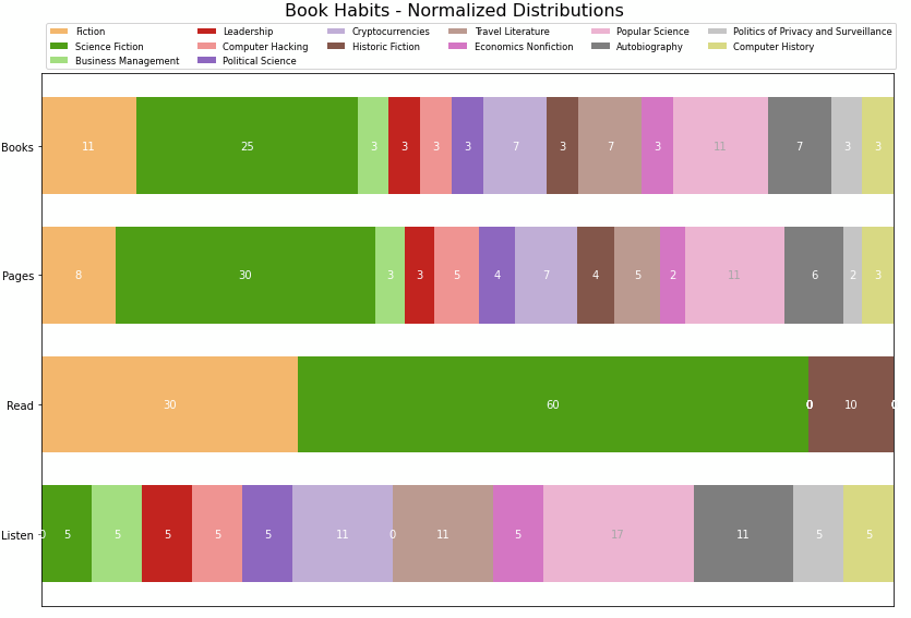
As the whole point is to create efficient visuals that quickly give an overview whilst at the same time allow for details I decided to try the “horizontal barplot summary” from matplotlib example page. Lot’s of good inspiration there!
This meant that I had to normalize my data, meaning that the bars represent 100% and we’ll divide them into chunks based on attributes. Second challenge was to find an appropriate colormap that gave clear distinction between the categories.

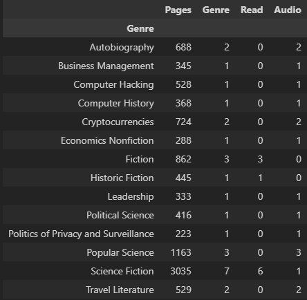
I’d like to round off this post by sharing the elegant way of using pandas to transform the dataframe to a nice table.
df['Read'],df['Audio'] = 0,0
df["Read"][df['Type'].str.contains("Book")] = 1
df["Audio"][df['Type'].str.contains("Audio")] = 1

byGenre = df.groupby(by='Genre')
a = byGenre.aggregate({'Pages':'sum', 'Genre':'count', 'Read':'sum', 'Audio':'sum'})

I really like tables and text; making graphs better and more efficiently is hard. Communication requires a clear understanding of /what/ to show – then the why will come by looking at matplotib’s examples 😉
Until next time
This post was supposed to be about the application of GPT-J or GPT-Neo. Maybe next week? 🙂
Even if this was quite short and sweet it was a bunch of fun to wrangle with matplotlib and pandas. It’s easy to get rusty.
For next post: GPT-J Feasibility Studysa
I can compile a list of “Title, Author”. I will try different techniques to populate “Genre” and “Pages” by using GPT-J, Google Sheets, Webscraping to see what works best for this little problem.
GPT-J is an open-source version of GPT-3 developed by eleuther that thinks it’s important that AI models are available for the public. I’m using it because I am a greedy guy. It can be accessed directly online at https://6b.eleuther.ai/ or by the python library “transformers” by Huggingface.
References
https://towardsdatascience.com/how-you-can-use-gpt-j-9c4299dd8526
https://aws.amazon.com/marketplace/pp/prodview-h5vz457l5i3lw (Rent AWS for GPT-J)
https://www.forefront.ai/blog-posts/how-to-fine-tune-gpt-j (Fine tuning)