Getting Back Into Shape | Part 2
That was quick! Back again for a short post!
I’ve spent some time thinking of the data logged and wanted to throw some quick graphs around based on the current dataset. It’ll also give me a nice oppurtinity to make some extremely basic excel graphs which I absolutely hate – probably for the familiarity and lack of elegance associated with “default excel graphs in a powerpoint” we’ve all seen too many times before, but I digress.
The primary idea is to capture the increase in training capacity. Current schedule is many long and slow rides to burn fat and increase endurance. Often in nice weather. Here and there a short but intense ride on the trainer to brush dust of the higher heart-rate levels.
Trip Length over Time
An increase in capacity should be reflect in length / time / data relationship. My intuition of visualizing this is by length over date. This could be used to create some regression-lines that maybe would make sense.
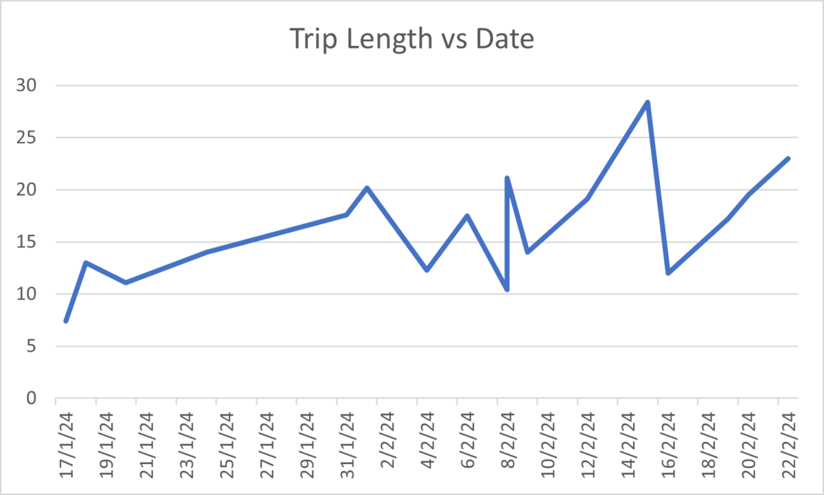
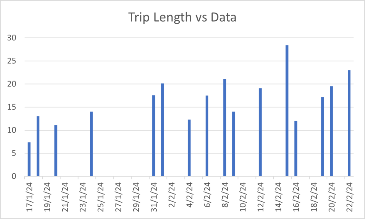
This is not only wrong but extremely misleading. It does not reflect frequency of training-sessions and in addition it “punishes” short and frequent exercise. A fair visualization would be to show each trip individually in a simple bar plot.
A general impression of progress made can be shown as “Accumulated Length” over dates
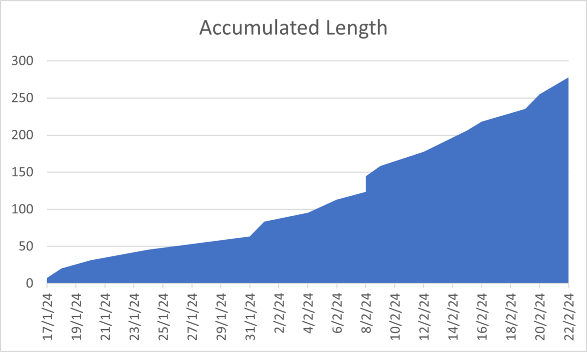
Here we can see the increase in capacity due to frequency and longer trips. As the underlying dataset reflects three activities (Nordic Ski, Nordic Ski w/kid, Indoor Cycling) the training effect per km is extremely misleading.
Sorting into different activities with overall calorie-burn is a topic for another day! What really matters are views like this

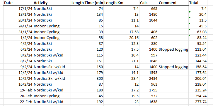
Raw Data