Patent Analysis | Patent Time
The indication of innovation and investment into a field can be found by studying patents – a big picture understanding can be gained from monitoring the frequency of new patents within a field with more details readily available for those who are willing to dive further down the rabbit hole.
The number of available patents is the backbone of our trend curves. These patents are subjected to regional rules based on where they are filed either it’s international and national. It is vital to have some basic knowledge about when patents are released for the different domains as it makes it possible to both understand and predict the development of patent-based trend-lines.
This post will mostly a documentation of the discovery and realization of this process by investigating a rather non-intuitive phenomenon mixed together by a lesson in selecting correct graphing methods and how little research we’ve done beforehand 😉
Basis for the analysis is “Run/22-03-22/crawlerALL_22-03-21_200_20_translated_valid_unkind_unique.csv” which is available here.
The Main Events for Patents
All patents has three primary events during their lifetime:
- Priority Data – Which is valid from the day the day they are filed. Kindcode “A”
- Publication Date – The patent is now publicly available. Kindcode B, B1, B2
- Granted – Final approval granting exclusivity for the described invention
Trend-analysis should be visualized using priority dates – the date given to a patent at “application date”. By using “application” date – we can se the current interest at a specific date. The downside is that it takes a certain amount of days to have – let’s say 50%-75% released. We’re not aiming for 100% it the most extreme can take years to be published, not uncommon for American patents. So the question is, how far behind do we have to look to have a statistically sound picture of filed patents?
If you google “How long does it take to get a patent” – you will most likely get a an answer of 22 months from this site as the top search. Does that hold up for tunable optics patents? Is there any regional differences? Let’s have a look!
Statistics for the Whole Dataset
For our analysis we need some additional outputs. By using patentCodes, priority-, publication and granted-dates we can easily compute “Region”, “Patent_Time” and “Grant_Time”. The extended table is saved as StatusChangeTime.csv.
patentTime["Publication_Time"] = (patentTime.Publication_Date-patentTime.Priority_Date)
patentTime['Publication_Time'] = patentTime['Publication_Time'].dt.days
patentTime["Grant_Time"] = (patentTime.Grant_Date-patentTime.Priority_Date)
patentTime['Grant_Time'] = patentTime['Grant_Time'].dt.days
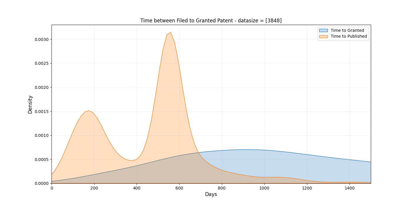
patentTime['Region'] = patentTime['patentID'].astype(str).str[0:2]The following KDE plot is based on _only_ granted patents.
Using pandas describe() function on the dataset we are able to capture a statistical description:
| Stat/Event | Priority to Public | Priority to Granted |
| Mean | 469 days | 1201 days |
| Std | 313 days | 666 days |
| Max | 3297 days | 5273 days |
| Min | 10 days | 69 days |
| 25% | 212 days | 725 days |
| 50% | 548 days | 1077 days |
| 75% | 556 days | 1538 days |
It turns out that some very old patents did not not have priority dates – which only affect the minimum values in a significant way. That was another lesson in datascience – always be prepared for inconsistent data that will challenge even the most basic assumption you might have about data integrity. It’s luckily an easy solution, add two conditions to ensure that priority and grant-dates is not null.
One can observe that the standard deviation is very high and that the data is skewed. Is is better to use quartiles to understand data that does not follow a normal distribution. But the “Twin Peaks” makes even the use of these quite tricky due to high variations at two distinct locations.
What is the underlying mechanism of the “Twin Peaks”? Instead of setting up many theories based on one graph alone, let’s instead create a few to acquaint ourselves with the material. We can
- Split into regional groups (China, Korean, US and World)
- Look at mean time based on region and year.
- Divide the patents into patent-time bin to see how they develop (no averaging as in 1. and .2)
For the following plots I only require the patents to have a priority and publication date unless more conditions are specified. A requirement of granted status would remove many recent patents – as they often are granted a while after publication.
1. Regional Groups
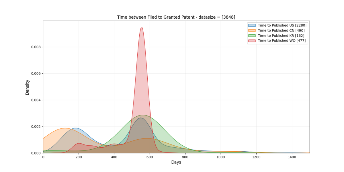
Both China and the US display “Twin Peak”-ish behavior. Korea and International (WO) based patents tend to strictly follow a specific time. The World wide patents has a super clear trend that I didn’t see before the 2nd iteration of all the plots 😉
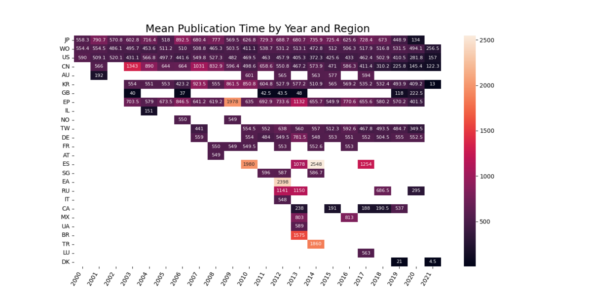
2. Mean plotted by Region and Year
Are we seeing a change in patent policies? If yes, where? By computing the mean publication time for each region for each year we’ll end up with a plot that might shed some insight in the mechanism.
3. Grouped by Patent Time
To avoid being affected by smoothing in the KDE plots or extreme values for “mean publication” time we can count the number of patents based on “months” from filed to published. (We call this type of sorting binning – sorting by bins)
Have you heard about the Patent Coordination Treaty (PCT) before? Me neither. It says that patents for which international claims are to be made has to be released for the world 18 months after the priority date. There are roughly 150 nations in this treaty.
The other peak probably comes from a desire to reduce time to market?
Priority Dates as a function of Time and Region
We can try to get a better understand by plotting patent time for the the top countries as a function of time. The dataset is reduce to represent only patents that shows clear interest in tunable optics.
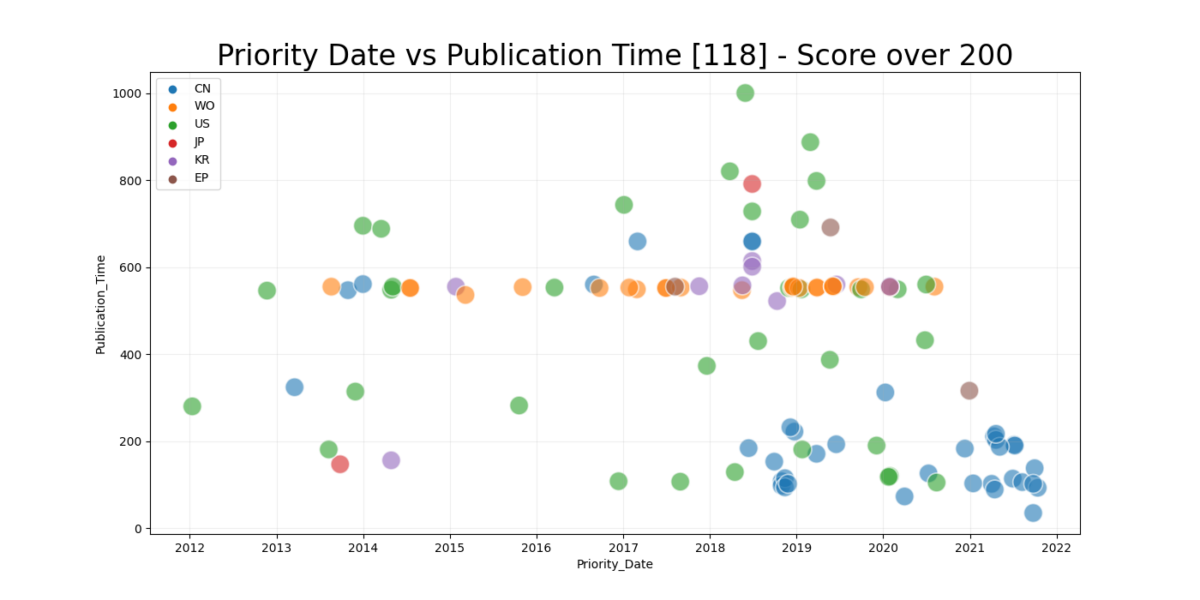
While this graph shows clearly a trend -a gradual increase of fresh patents by an increased frequency. It shows a few other things as well – Chinese and American patents are the combined cause of the “first peak”. Today is March 26, 2022 so that means that 548 days before today would be September 24, 2020. We can see the lack of patent on the patent_time, date scale develop increasingly.
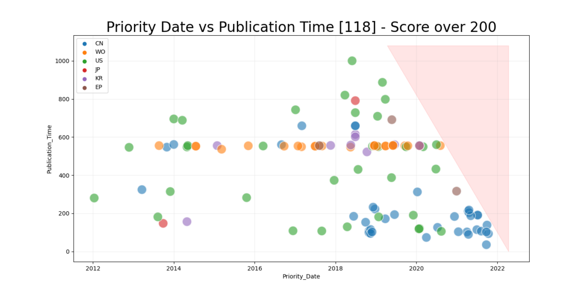
If we add a skewed line for the unavailable patent_time/date and one for the current date showing 50% realization we get a quite interesting picture.
Future work
Armed with an understanding of the mechanisms behind the Twin Peaks of publication dates, density of the dataset and quartile information we might be able to make rough predictions on how many patents to expect on a given date based on the number of patents within the time frame and by extrapolation using the quartile information. Raw trend-lines can be put in a statistical meaningful way to predict future development as well as finding a statistically stable point on where to confidently analyze the trend-curve.
Any ideas, questions, observations or plain old feedback ? Let me know!