Patent Analysis | Growth Rate
Disclaimer: This post contains nuts. And maybe worse, results from playing around with numbers and statistics to possibly mold them together into a comfortable narrative. Be advised that the following exercise is extremely volatile for such a low data sample. The method might even be faulty/misleading too.
If you happen to know your way around different statistical models, please get in touch. I’d love to get some pointers and/or have a friendly chat about the topic!
Growth Trends
Instead of looking at cumulative trend-lines – which shows a growing number of patents as a function of time – we want to look at the underlying growth mechanism. What is the development of frequency in which patents are filed for?
Meaningful regression-lines should try to capture the number of patents filed for within a time period instead of looking at the individual patents. Looking at patents filed by weekly/montly/quartly will give a much clearer picture on the development as higher frequency data will contain more “noise”.
Trendlines based on Montly and Quarterly Bins
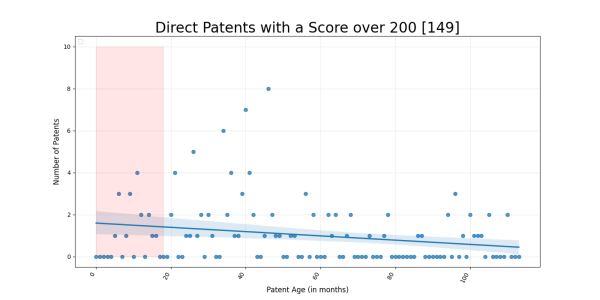
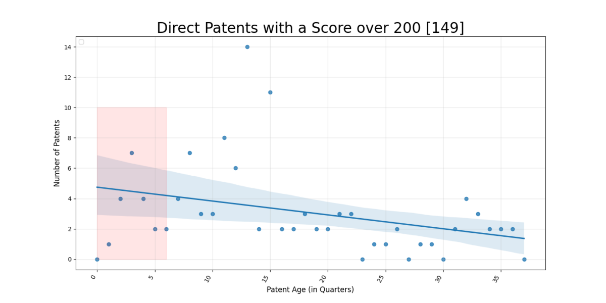
One thing to remember when looking at the regression-lines is that the frequency of patents will drop due to the fact that patents are published – typically 18 months – after being filed. One solution is to ignore the last 18 months entirely or look at probable developments using known data on filed to publication time.
Yet there is still a clear trend – the growth rate is increasing! This means that the cumulative trend-lines is expected to accelerate moving forward!
Adjust by “Publish_Time” Probability
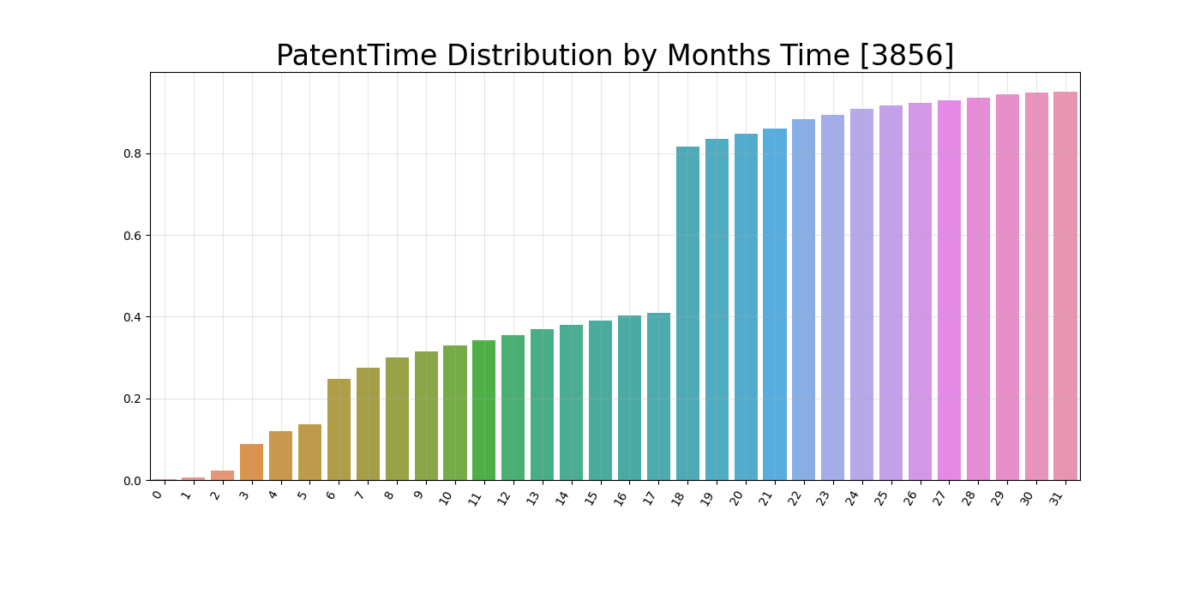
Remember the disclaimer? Let’s be reckless – but not bleach-drinking-reckless! In “Patent Time” Publish_Time was plotted and grouped by months, seen below in Figure 3. The huge peak at 18 month displayed that the typical timeperiod from application to published is 18 months – mostly due to International rules and Korean pratices. This means that a majority of the patents filed after September 2020 (today is april 2022) is in the “Aether” and unknown.
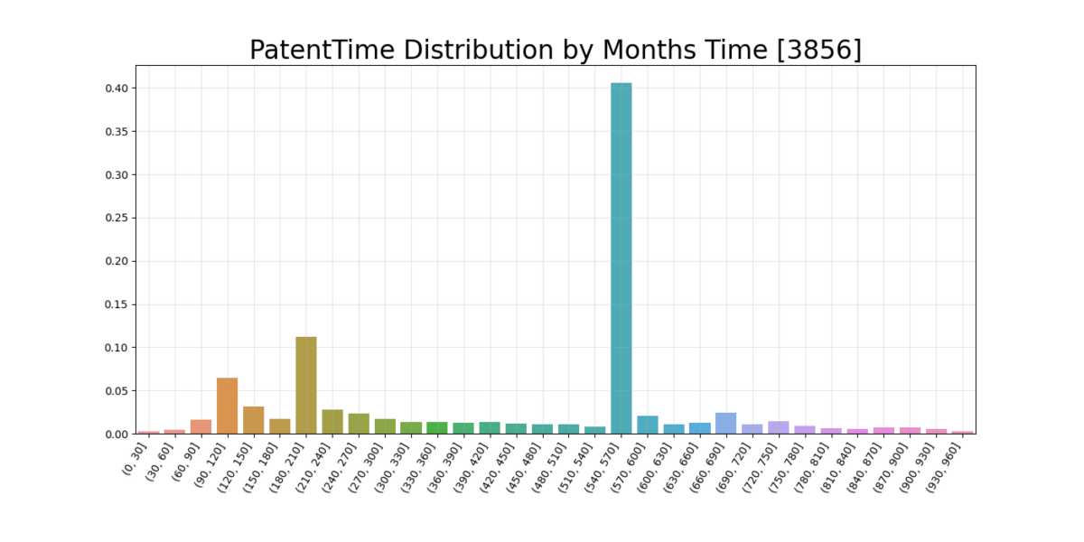
There are three repeating periods where there is an extra high chance for patent publication, these are 4, 7 and 18 months after filing – where the latter is massive! This data is normalized – and should surmount
If we summarize these values we get a probability profile for each month, into how many percent of the patents are released so far?
Bold Predictions
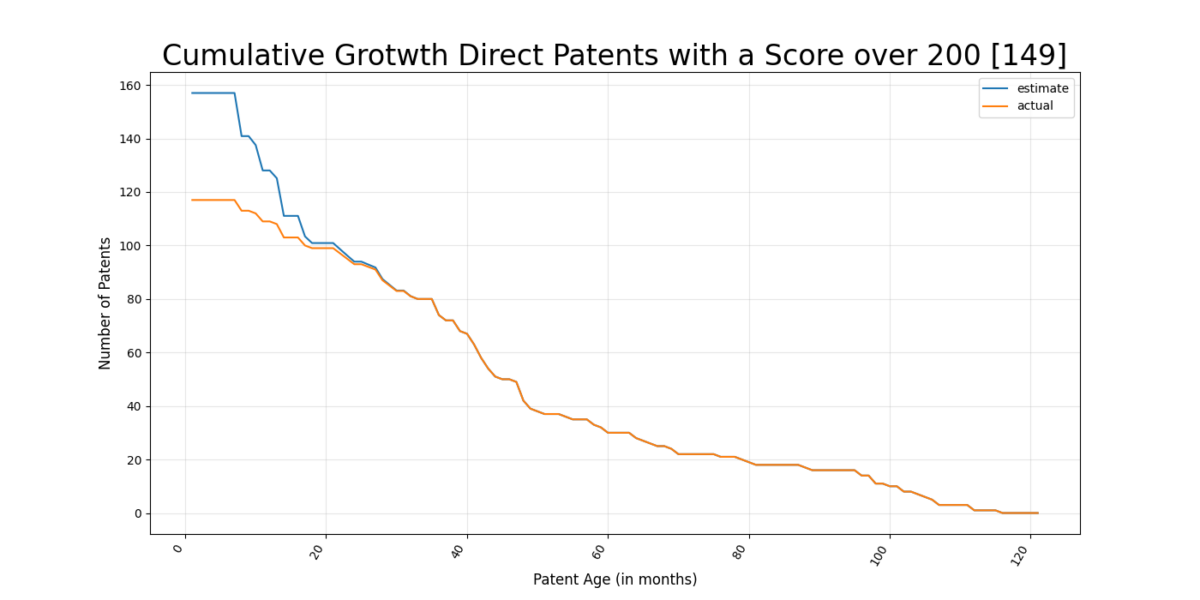
We can now take the leap from the actual monthly overview and divide the amount of patents by the probability function get an “estimated” amount of patents to be released. This should give us an indication of how the trend curve can develop for the all dates – taking into account the low probability of published patents before the 18 month mark.
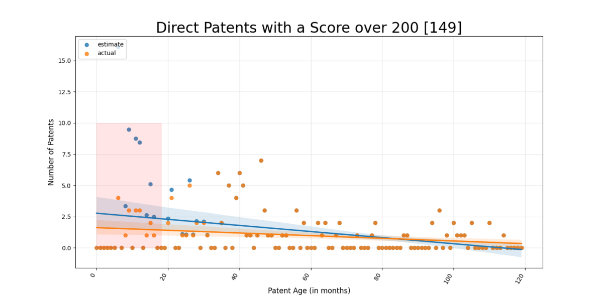
While this looks promising – it’s super important to stress that this only gives an indication of development and it might be awfully wrong. Let’s revisit this in 6-8 months and have a look!
The plot should be viewed as a flow of points moving from left to right – jumping upwards for every patent submitted. Expected number of patents drops drastically at 18 months which might actually affect the regression line to look much more positive than it probably should…..again, would love to talk someone who knows this and do a follow-up !
Remarks and Future work
We see positive trend developments and exciting predictions. A lot is happening in the segment and hopefully we might be able to see some new products?
Future work will focus first on doing a keyword analysis / spectrogram to improve the scoring system. This is expected to lead to a few interesting discoveries and increase the quality of the analysis. After this we’ll start performing new runs – its almost been a month since last run. This is partially because the quality is so low that it makes sense to document and review the process so far before increasing the amount of data.
That’s it for now!
